Debunking a miracle school can be tedious work. Debunking an entire district is, generally, even worse.
But when I heard about the recent ‘miracle’ in Denver, I was pleasantly surprised when I got the opportunity to explore Colorado’s excellent data system called SchoolView.
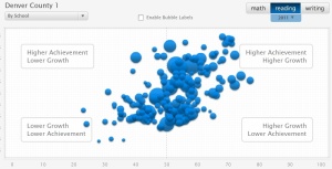
Within a few minutes, I was able to produce awesome pictures like this
 In the above image, the 180 3-dimensional bubbles (homage to the bubble scan-trons on the standardized tests that produced them?) represent the 180 schools. The size of the bubble is proportional to the population of the school. The higher achieving schools have bubbles higher on the graph, the lower achieving ones are lower on the graph. How far left and right is based on the nebulous ‘growth’ metric, which I learned about recently with regard to New York City’s way of comparing schools.
According to the state website ‘growth’ for a school is a number between 0 and 100, which is calculated by taking each student in that school and comparing his/her score on the CSAP test to the score of all other students in the state who had gotten a score similar to that student on the CSAP the year before. Then all the students ‘growth’ scores are sorted and the middle score becomes the growth score for that school.
If you go to the website, it instructs you how to interpret this score:
What is considered typical growth?
The answer depends on whether you are referring to student growth percentiles (individual-level scores) or median growth percentiles (group-level scores). As defined by Colorado State Board of Education rule, a student growth percentile for a single child that falls within the 35th-65th percentile range reflects Typical Growth. When referring to median Growth Percentiles, such as for a school or demographic group, the Colorado Department of Education (CDE) considers a median of 50 to be typical growth for school or group. The statewide median growth percentile in each subject and grade is the 50th percentile. When examining medians for schools, grades, subjects or groups, it is useful to look for differences from 50 when investigating growth. These data are particularly useful for benchmarking purposes and to understand how other schools or grades are doing in addressing problems in the educational system, such as the frequently observed achievement gap between poor and non-poor students. Comparing median growth percentiles for these two groups within a school or district can tell us whether existing achievement gaps might be closing. There is currently no single “rule of thumb” for deciding what are low, typical, or high growth median growth percentiles.
So a ‘typical’ score is somewhere between the 35% and the 65%. In other words, this stat is completely bogus.
Colorado’s SchoolView data center enabled me to get the growth statistics and also the achievement statistics to investigate the Denver miracle.
First, I looked at the absolute test scores and learned that they have changed very little in the past 3 years.
Math
 As you can see, the scores have been, as they say, ‘flat.’
But they didn’t claim victory based on their absolute test scores, but on their ‘growth’ which they boasted they had one of the top 3 growth stats in the state.
Well, their easy to use (for me, anyway, but not, apparently, for anyone working for The Denver Post) website enabled me to quickly find the growth metrics for black and Hispanic students and compare them to what they considered ‘adequate’ growth.
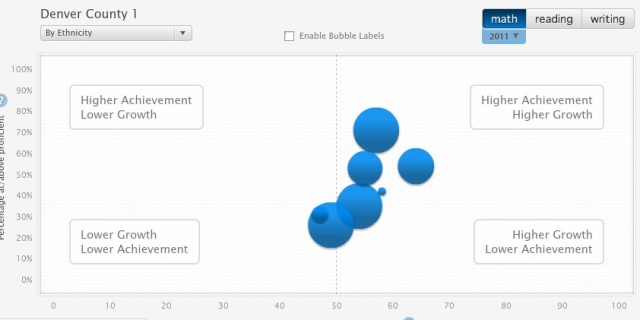
Here they are, with some commentary:
Math
The larger bubbles on the bottom represent black and Hispanic students. When you ‘roll over’ the bubbles with your mouse you learn black students have 49% ‘growth’ vs. 88% ‘adequate’, while Hispanic students have 54% growth vs. 79% ‘adequate’.
Reading
Black 46% vs Adequate 58%
Hispanic 51% vs Adequate 60%
Writing
Black 50% vs Adequate 70%
Hispanic 51% vs Adequate 71%
Now, I’ll admit that I don’t understand how to interpret all these statistics, which I think is the point. They make up new statistics that are very confusing and then use them to declare miracles when really all the reform they’ve done there hasn’t amounted to much.


It’s not “nebulous” if you just don’t understand it. It seems well defined, but definitely subtle. I agree the metrics can be confusing, and share your skepticism that district officials may very well hide behind a fog to find some numbers that make them look good. Nonetheless it’s worth it to endeavor to understand what you’re looking at, as there is real information there.
I recommend this primer on student growth percentiles, which helped clarify the concepts for me: http://www.cde.state.co.us/cdedocs/Research/PDF/Aprimeronstudentgrowthpercentiles.pdf
The 35-65 band is for individual students — that is, when you see that your child is in the 40th growth percentile, what does that mean? Colorado has decided that growing as much or more than 35 to 65 percent of the students who started in the same place is considered “typical.” This is similar to helping parents understand whether their child’s gains in height and weight can be considered “typical.” it is not a bogus statistic, it’s an interpretive guide.
To characterize a school’s growth is tricky, since of course a school is made up of many students, some of whom are poor-performing but have made big gains, others are of middling performance and middling gains, etc. The mechanism chosen, a reasonable one, is the following: compare each student’s growth to other students who started in the same place. So now you have a measure for growth of each child, independent of their starting point. How to characterize the overall growth of the group? It’s the growth of the middle, Ie half the students grew more and half less.
In your second set of charts, you are not looking at absolute scores. You are looking at the percentage of students with an absolute score over the “adequate” threshold, which is importantly different. That kind of metric is one of the great weaknesses of NCLB and many so-called “accountability” systems — it doesn’t show changes in the distribution of scores that may underlie a coarse cutpoint.
Aaron,
You’re right. ‘Absolute’ test scores wasn’t the best way to describe them, though I did understand what they meant. I also understand the growth rate thing, but only to the extent to which anyone else can understand how to interpret a single number to characterize a schools growth in comparison to other schools. When that is the only metric that is used to prove that the reforms of ‘choice’ and ‘accountability’ work, I get pretty concerned.
Your last charts show, I think, that black and Hispanic students have somewhat lower performance, and middling growth rates. I suspect the “adequate” growth rates are defined as those that would catch students up to proficiency benchmarks. I agree that growth percentiles around 50 are a far cry from a miracle — after all, 50 is exactly typical — the growth that half of all students who start from the same place achieve.
Anyway, hope that was helpful rather than annoying — my first sentence was a little snide. I just don’t want smokescreens on any side — I think this data tool is great, and want it to be put to the use of better understanding. Thanks for your thought-provoking post.
SFUSD’s got a similar tool:
http://portal.sfusd.edu/apps/home/strategicplan/sfusd.html
I was there when they rolled this out to administrators (which ended up being a media fiasco because the local paper decided to get upset about the Jimi Hendrix images and quotes on the presentation handouts).
At the time I thought it could be neat, although there were immediate issues. For instance, Mission Ed Center seems to be a nasty outlier just begging for ed reform, until you realize it is solely for new, monolingual Spanish-speaking students who stay no more than a year.
However, I don’t think it’s been updated, ever. This is a problem I have with data collection in education and ed reform in general: there’s always a new metric or new program that is going to fix everything, but it’s invariably abandoned for the next quick fix before it had enough time to be tested. All this relentlessness and urgency lead to a lot of Chicken Little-style planning with no long-term impact.
Pingback: Remainders: Highlights from the Atlantic’s Joel Klein letter pile | GothamSchools